
Background
The Grand Budapest Hotel was set in a fictional European country in the early 1930s. A luxury niche hotel serving high-class guests, The Grand Budapest delivers nothing less than exceptional service. My goal was to design a website that would emulate a modern version of this kind of guest.
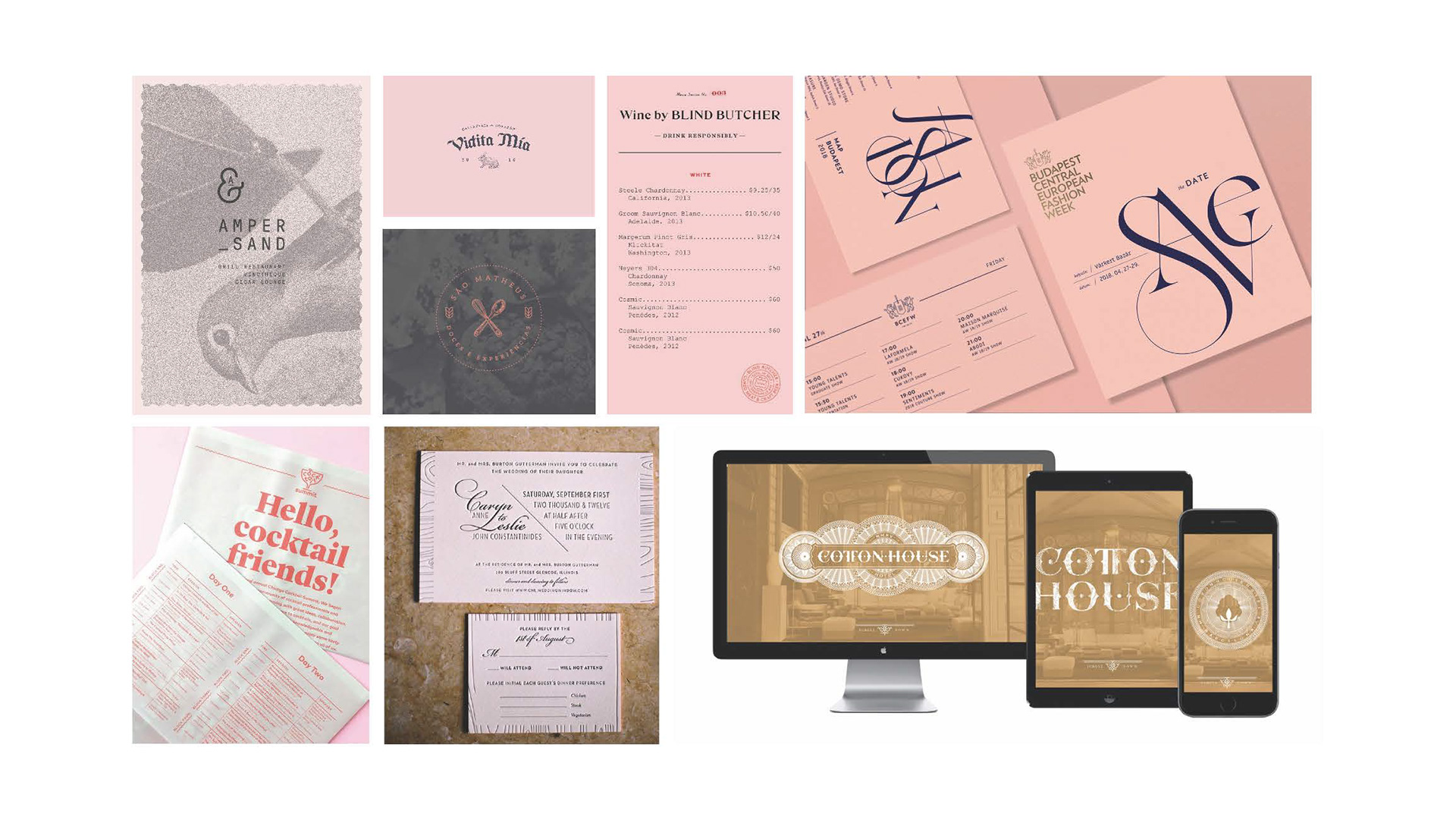
Wes puts a lot of time and effort into the details of his films. Inspired by the film’s Oscar-winning production design, I wanted to make a nod to his attention to detail regarding this. The website may exist in the digital realm, but it strike a balance with the world of print. My intent was to design a modern and user-friendly experience while still celebrating the props that Annie Atkins so thoughtfully designed.
This clip demonstrates the reservation request flow. As users scroll down and navigate through the site, the nav bar element becomes a flyout. Thus, users are encouraged to make a reservation at any point while visiting the site.


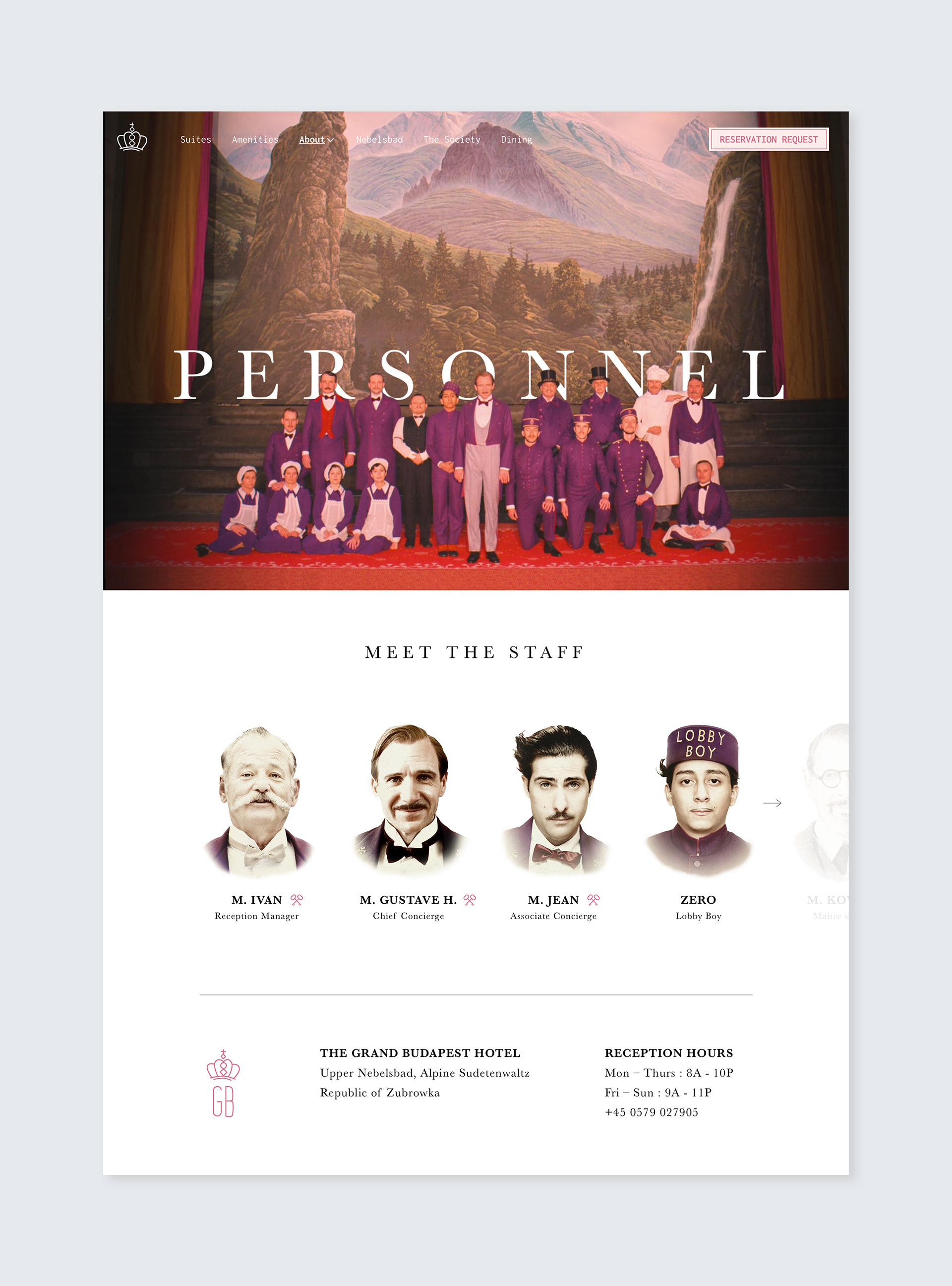
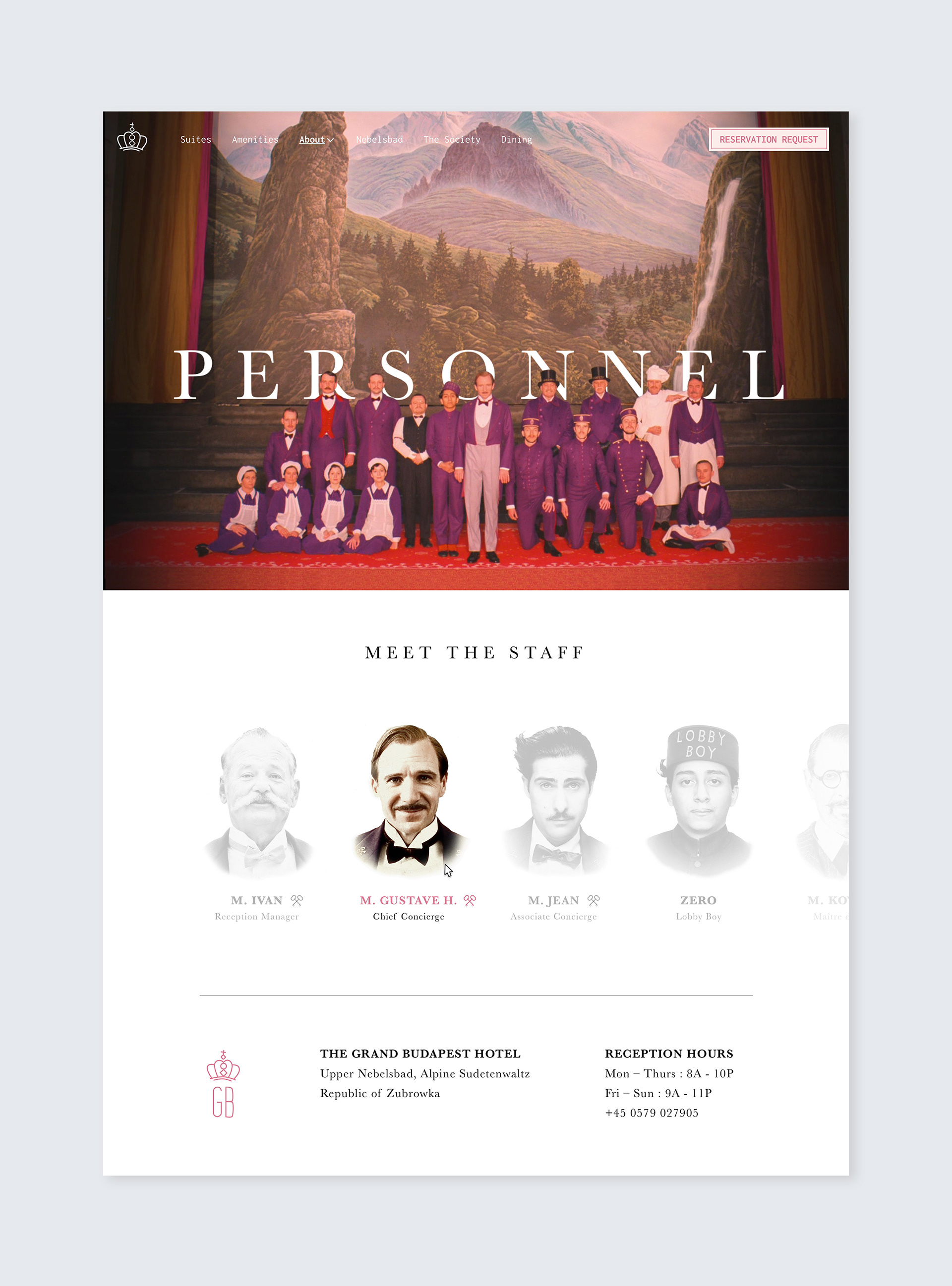
The user can scroll through staff members. Those with crossed keys symbols are members of the Society of the Crossed Keys. The hover state on the right shows what would happen as the user interacts with the page.