Brand Concept
The term moonshot entered the lexicon in the 1960's as shorthand for an undertaking that is radical, significant and lofty. It alludes to a time in America where someone called us to action, and together we made the choice to create something that changed the modern world forever. This bold yet playful concept makes use of geometric shapes to represent the movement of celestial bodies.
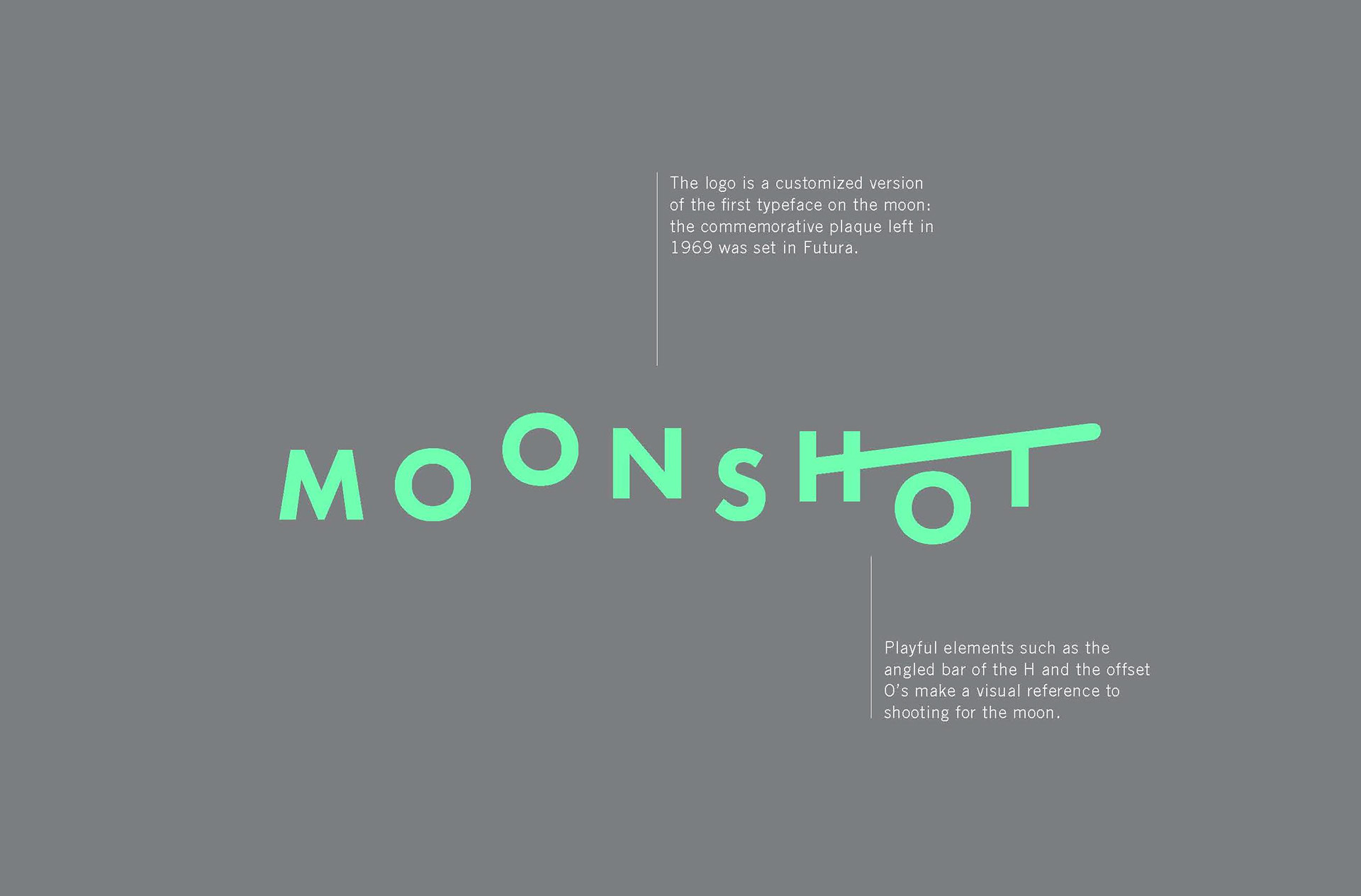
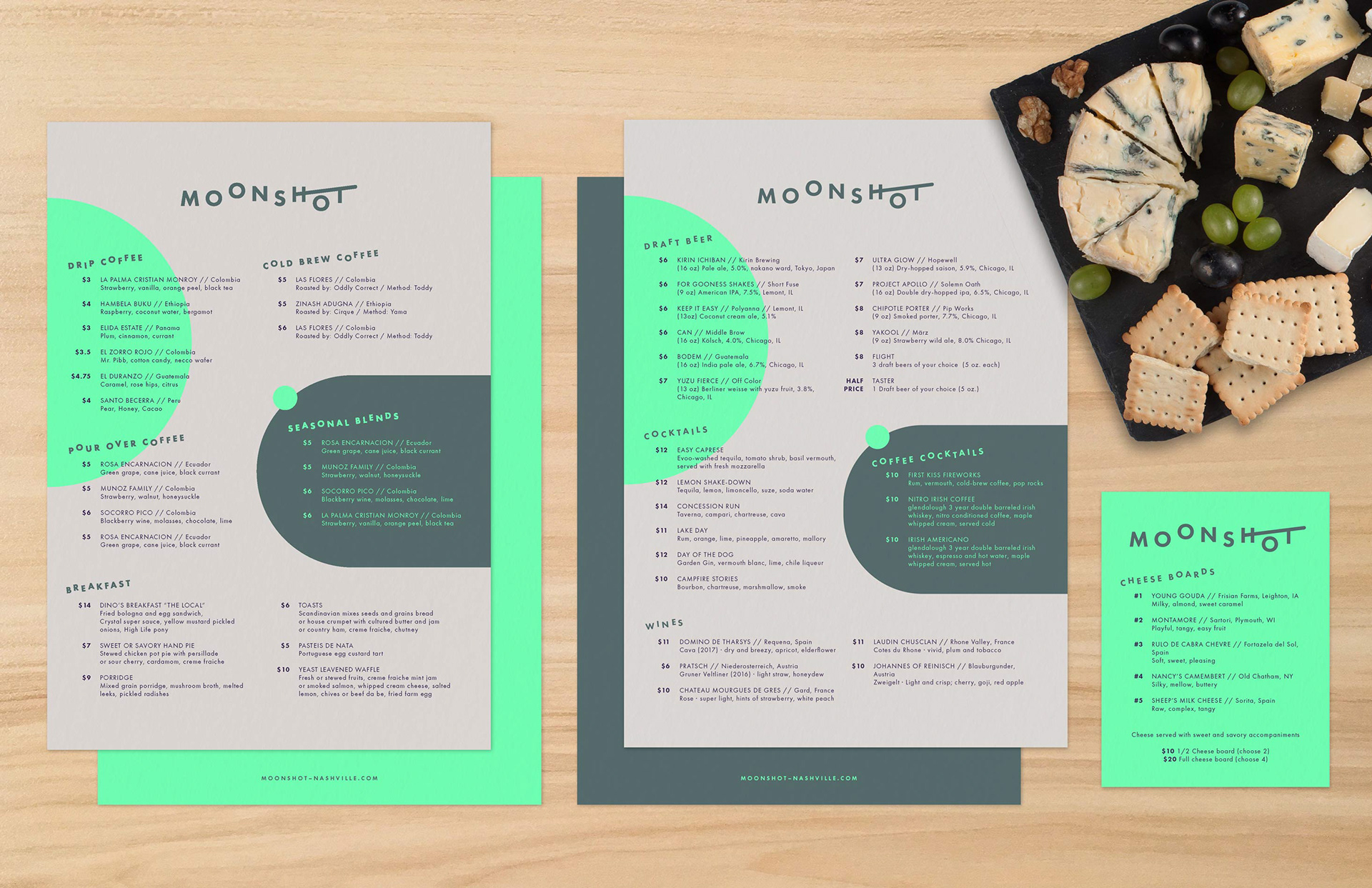
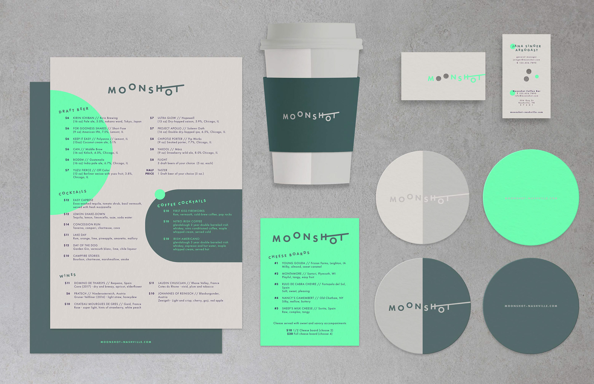
Abstract shapes bring visual interest to the identity, tying in the movement of celestial bodies around their orbits.
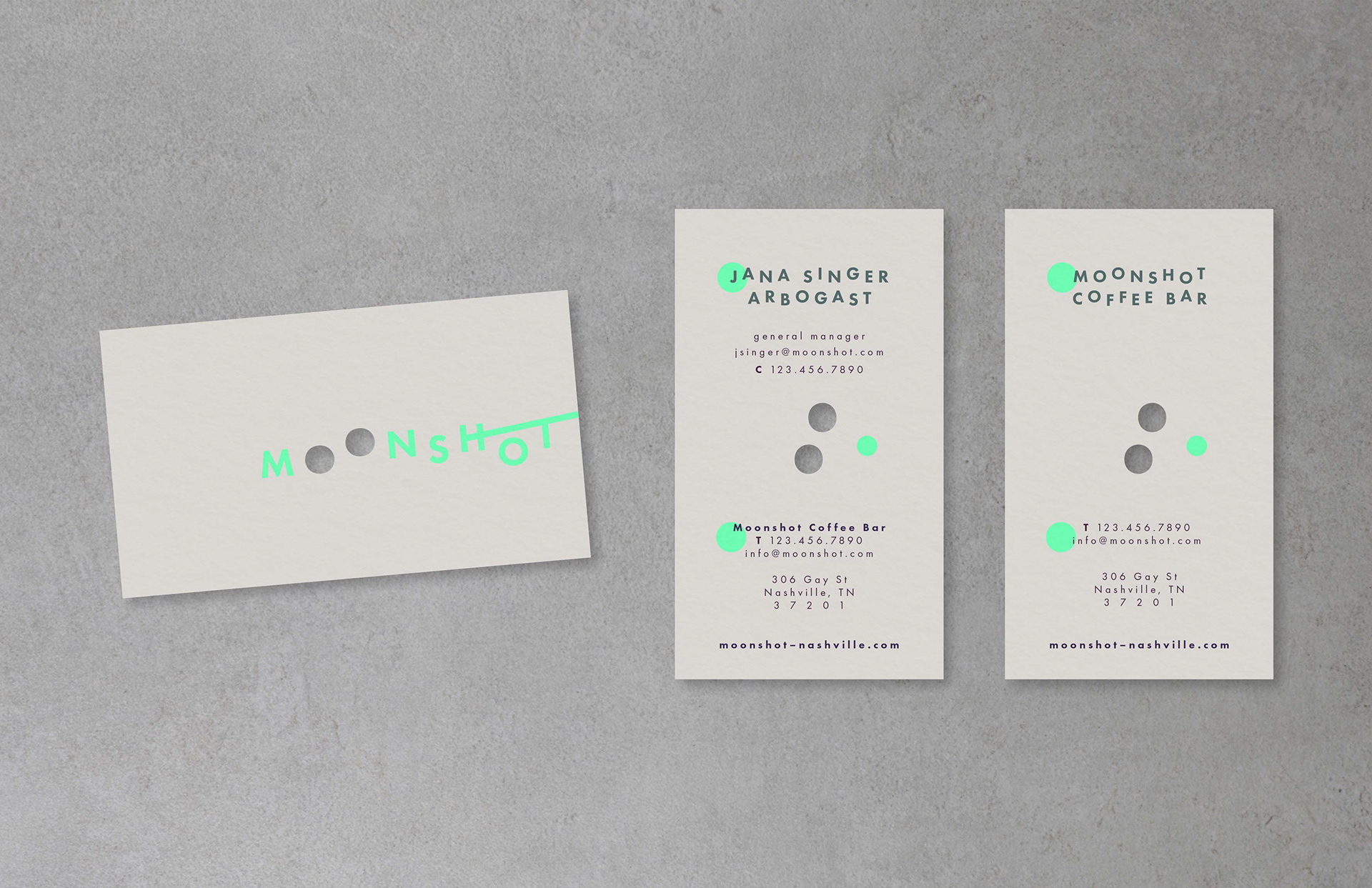
The jumbly type of the logo is used repeatedly throughout the brand identity, as seen in employee names on the business cards.
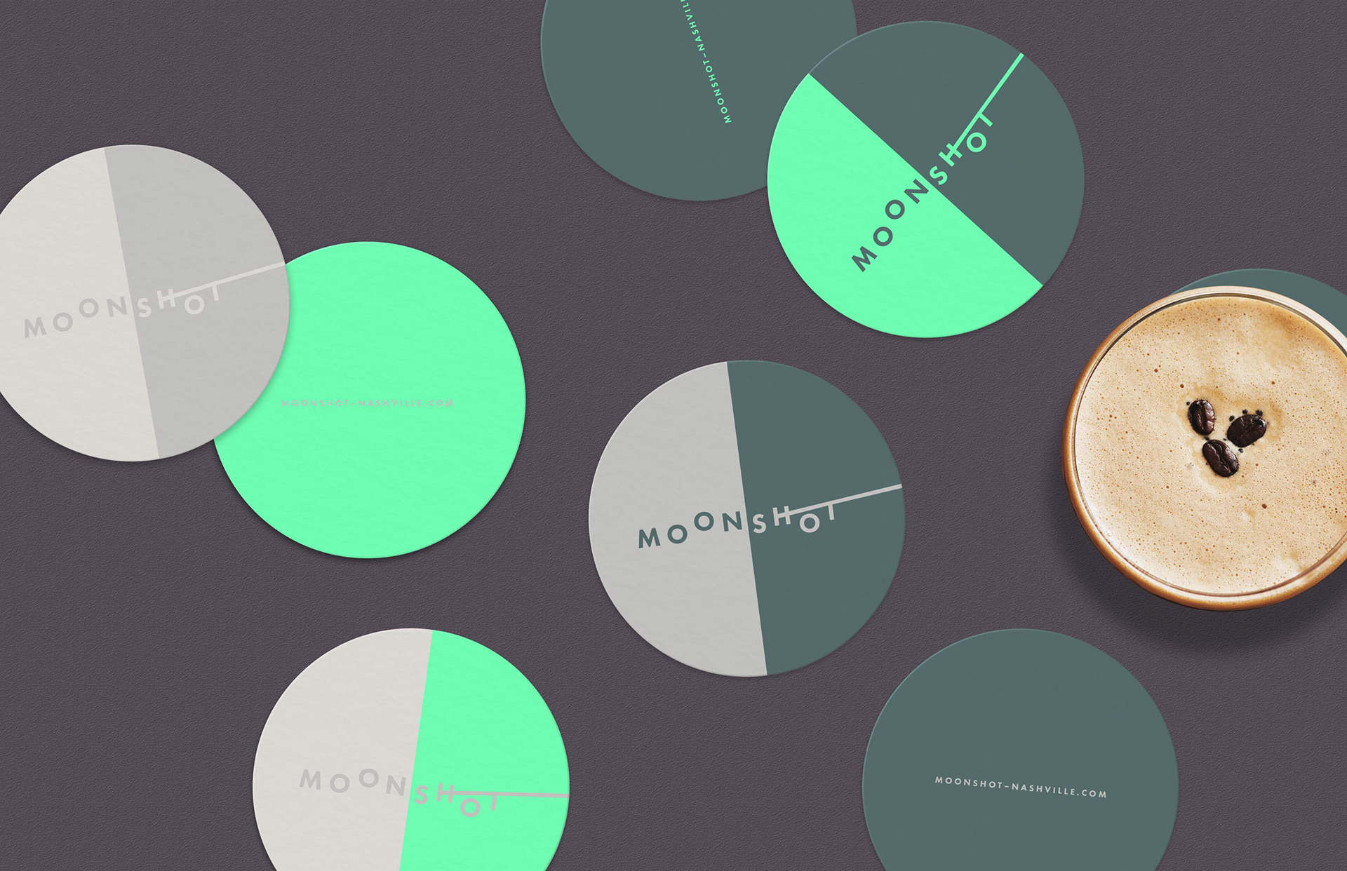
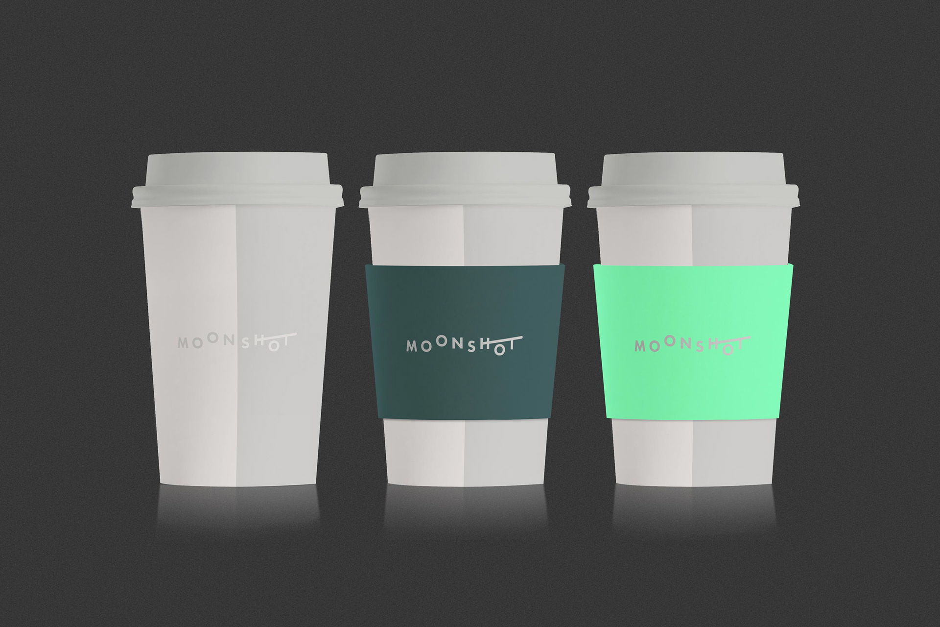
Two-tone coasters and coffee cups offer a simplified interpretation of lunar phases where the moon is half illuminated.
This concept was presented to the client as one of four initial design directions and does not reflect the current café branding.